Wednesday, 18 November 2009
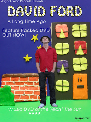
Magazine Advert Analysis - Prefab ...

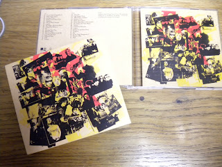
CD Analysis - Legacy the Best of Mansun


DVD Analysis - Acquired Taste


There isn't a strong representation of the artist on this Digipak which doesn't follow the typical conventions. There seems to be quite a strong visual relationship between there other products by the use of animation for their album covers, which in turn makes it recognisable for their fans and striking to look at. There isn't any special content e.g. interveiws with bands.
DigiPak
- Collectors album- usually cost more than average CD/DVD
- Limited edition content- Bonus Tracks, Posters, Live Performance, Bsides/covers/rare songs, interviews with band/Behind scenes on tour/video, 'Making of' featurette, Greatist hits
- Website
- Reviews
- Screen grabs
- Detailed information-tracklisting
- song/album title
- artist name
- record label logo
- ratings/parental advisory label
- Running time
- Band members
- Personal note from band
- Artwork from band
Functions and conventions of music magazine adverts
Functions are:
- To Promote the artist
- To sell the song
- To be eyecatching- visually striking
- Song/Album title
- Visual links to videos- Intertextuality
- Reviews (Newspaper, Music press, Celebrities/DJ's- Trend Setters)
- Condensed information on content
- Release date
- Artist name
- Where is it available to purchase (HMV,Amazon)
- Record label logo
- Website (official artist site, Myspace)
Wednesday, 11 November 2009
editing!
Thursdays editing:
beginning live footage
transitions - zoom in and out
a shot reverse
colour filter
drag out some shots
digipak
magazine advert
Monday, 2 November 2009
Editing & Filming Plan for next 4 lessons
We have also planned to stay after college hours, 2 nights this week, which we have done in previous weeks, as we know animation takes longer.
Teacher Rough Cut Feedback
Your video is fabulously unique. The selection of mise-en-scene is brilliant, the sets, props and costumes are all approriate to the genre and expertly constructed.
The video is very obviously not in the correct order yet, this needs correcting ASAP, there are some unsteady sections which I assume is just because you haven't edited it properly yet.
Feedback on Representation of Artist
There is a good use of close-ups which could be enhanced if there were more in the beginning in order to firmly establish your artist.
I am intrigued by your live action section. Plan it very carefully and ensure that it is good quality footage as it would be a shame if poorly filmed live action reduced the current high quality of your video.
Your video has a charm to it which makes your viewer smile. Keep up the good work.
Response to Feedback
Peer Feedback
The music video is fully animated and therefore uses many of the shots and inspiration of other animations. It looks similar to footage from a children's television programme and makes the viewer feels happy and slightly child-like which is clearly the kind of thing they were trying to create. We thought it was quite similar to what they achieved in this......
Peer Feedback
The lyrics didn't particularly link or seem that obvious to relate to what was happening, however the setting and the Hollywood sign were impressive and did relate to the theme overall. The little guy was very detailed. The animation has obviously taken effort and time to make. Maybe with the ending the guy and the girl could get married or somehow show they were together.
Peer Feedback
General Feedback:
Original, and well constructed anamation, the ideas and props used illusrate the song's storlyine very well. However the songs lyrics do not compliment the visuals of the animatic
Peer Feedback
- The slow paced & calm video, matched the genre characteristics of acoustic music.
- Generally acoustic music is based on romantic ideas or settings/situations. This rough cut fits with this genre due to its romantic ideals.
- The longonamity of the shots work well with a variety of decor presented. It allows viewers to experience the emotions through the shots which fits well with this genre.
No improvements, fits well with genre.
Sunday, 1 November 2009
Evaluation of Filming and Editing
Our music video consists of stop motion plasticine models throughout with a short sequence in real life. With the models being constructed of plasticine there have been many problems that we have had to face while creating our finished product.
The first hurdle that we had to overcome was lighting. If we wanted our box that we would be animating to be well lit we would have to use lamps, these lamps created alot of heat and we found that it started to melt the plasticine after a while making the figures deformed and we found them hard to manage and move around. We overcame this by lighting our box with the natural light from the media room and also fair lights that we poked through the back of the cardboard to look like stars.
There were various parts throughout filming where we had to zoom into our models face and into other objects in the scene the first way we tried it was by zooming in a small amount and then taking a picture every time we moved closer. We played this back to ourselves and we realised that it was a bit too jumpy. To improve the look of our zooms we changed the method instead of doing it slowly we zoomed in slowly and not stopping and while one person was zooming another was taking picture after picture really fast to make a smooth zoom.
The editing of the video didn’t always fit in with the music as various different parts of the stop motion filming had different amounts of frame. To solve this so that the video will fit in with the music we have sped up a few of our shots and also some of them we have had to slow down so that certain actions and events are parallel with the particular line.
The movement of our figurine is very stiff and in a particular part of the video we have to have him moving his head to the side to watch a car drive by. First we just tried detaching his head and then moving it round but this caused his head to fall off, we next tried putting a pin into his shoulders and then using that to pivot the head on this worked a lot better and looked more realistic.
We also have many different things that need to move and float as if by themselves we have done this by using fishing wire which looks invisible on the camera.
There have been many problems to overcome but they have all been solved very simply and are very close to finishing our final cut.

