Monday 14 December 2009

Media Evaluation- Alexandra Efford

1.In what ways does your media product use, develop, or challenge forms and conventions of real media products?
The indie genre of music is often recognized for its artistic and quirky approach to music videos and advertising. In many ways our video complies with these generic conventions. The use of plasticine animation adds a unique and innovative attribute, similar to that in well-known indie videos such as ‘pumping on your stereo’ by Supergrass ( http://www.youtube.com/watch?v=qQbVyWED6Ac ). The use of bright colours, abstract mise-en-scene and an engaging storyline makes the video generic and typical of this style of music; whilst our combination of real-life footage and animation could be seen as a unusual format and therefore a way of challenging conventions. The costume and action within our video and advertisements was also specifically chosen to relate to the style of other indie music and artists. One example is the artist playing the guitar. Indie and Rock music videos are often performance based, and instrumental sections are enhanced by footage of the artist playing the instrument. Using this technique within our own video meant that the audience could establish both a relationship with the plasticine figure as well as the real-life artist and his style of performing. The 2 images below show indie artists (paolo nutini and Jason mraz) that are shown wearing items of clothing that are stereoptyically ‘indie’. Our character is seen wearing similar clothes to the artists below. Costume was an element where we chose to use generic ideas and develop the conventions of other real music videos.


Goodwin’s Theory outlines some techniques that are used amongst all music videos to either comply with or challenge conventions. We took all of these into account when developing our media product. The first was Lyrics and Visuals (considering the relationship between the words of the song and the video footage). We found that it was common for indie videos to relate the story of the lyrics to the video itself, so used this format in our own video. Another was Music and Visuals (the connection between the pace of the music and the pace of the shots/transitions). This was another area in which we complied with common indie conventions and made the shots flow fluently with the tone of the music.
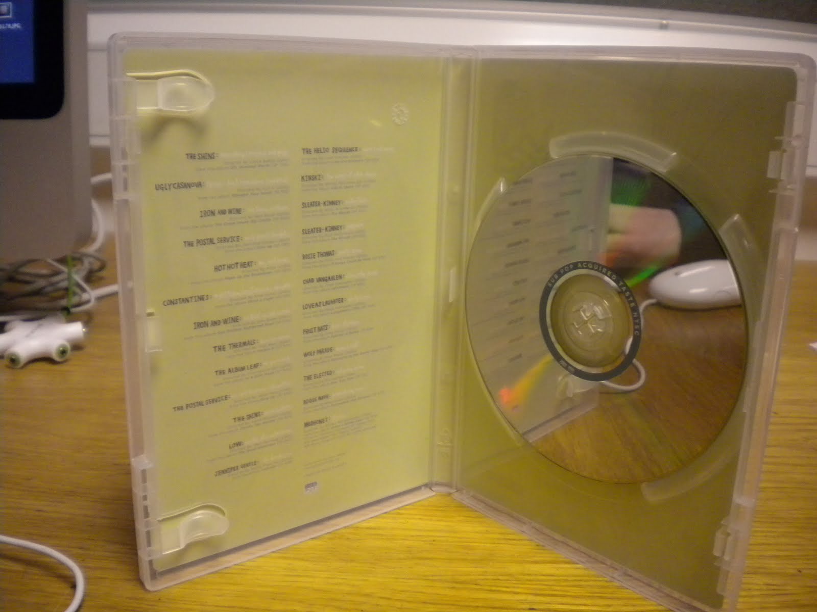
Our ancillary media texts also had a strong link with real magazine adverts and digipak covers. By looking at a variety of products before making our own we could generate a list of the information that is consistently included and make sure it was incorporated in our own. Examples include, Tracklist, Price, DVD Logo, Ratings, Reviews, Barcode, Variety of Fonts, Artist name and Song Title. We also found that real magazine adverts or digipak covers would often have a strong link to the artist or video that they were advertising. In our own pieces we used settings and colour schemes from the video to develop continuity and encourage the viewer to connect elements that they can see in all 3 products.

2. How effective is the combination of your main product and ancillary texts?
From the beginning of the project I understood how important it was that our video and ancillary products complimented each other and had a theme or stylistic element that made them recognizable. Before we had started any preparation for the music video, we planned and drew detailed drawings of our ancillary products in order to confirm that our 3 products would link with, and relate to, one another.

This is our magazine advert.
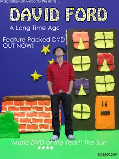
For this ancillary product we decided to put our real-life character into the plasticine world. We have used a background/setting that is also shown in our video in order to develop continuity. The bright colours and creative mise-en-scene relates not only to the style of our video, but more broadly to the indie genre. Many indie bands use artistic advertising techniques that grab the viewers attention and force the audience into wondering what the advert is about and therefore wanting to watch the video or find out more about the artist. I believe our magazine advert does this successfully as the combination of the real-life character and the plasticine setting gives the impression of the ‘un-known’ and persuades the audience into wanting to know more about the artist and his environment, whilst he seemingly finds out for himself. The artistic and compositional elements of this piece also helped us to engage the audience. The use of the yellow windows that lead the spectator’s eye from the yellow within the title down to the floor and then back up to stars ensure that the viewer reads and focuses upon all of the information.
This is our digipak cover.
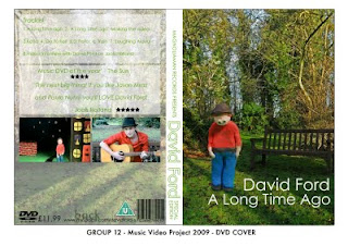
The photo we used was the antithesis of our magazine advert. We have used a real-life setting and put our plasticine character into it using editing techniques (Photoshop).

3. What have you learnt from your audience feedback?
As with real media products, it was important that we developed our product based on thorough constructive audience feedback. Within class we did a series of activities that allowed us to exhibit our rough-cuts and gain feedback and comments from our peers and teachers. One piece of feedback we initially received was that our video had to be more precisely timed with the lyrics. We took this into account and when editing used the marker tool on final cut to correctly alight pieces of footage with each section of the song. Precision timing meant that our piece appeared more professional and fluent. Our audience and peers also questioned how effective the combination of real life footage and animation was going to be. However, we stuck by this concept as we were intent on encouraging the audience to relate to both our artists real persona as a genuine and friendly guy, as well as his emotions and feelings that are represented through the plasticine figures. Another piece of constructive feedback that influenced our final video was that the end shot of Jamie playing the guitar was to repetitive and made the piece seem amateur due to the lack of variation. We made a conscious effort to change this as we could appreciate how the end shot did become ‘boring’. We took a risk by filming the extra shots of footage on the day of our deadline, as we then had only a short period of time to embed the close-up shots and make them run smoothly with the other footage.
Receiving informative feedback throughout the project definitely assisted my group and I in developing our video to attract the correct audience and understand the elements that were a success.

4. How did you use new media technologies in the construction and research, planning and evaluation stages?
This project has developed both my knowledge and understanding of new media technologies.
The internet has been extremely beneficial in all areas of this task. In the research stages it allowed us to, discover artists that had a similar indie style to David Ford, watch their videos using YouTube and analyse the stylistic techniques they used, approach the artist through the social networking site MySpace and access the artists website and gain an understanding of how he wishes to be represented. It also meant we could gather images that inspired our prop and costume ideas as well as colour schemes, settings and lighting.
We also used the internet to host our Media Blog. We used Blogger.com to set up a blog that all members of the group could access and update on regular basis, both from home or in college. Using the blog meant that each one of us could add to and read over our ideas as they developed over the weeks that we were working on this task. It also ensured that there was a constant log of where we were at with the project, and a regular reassurance that each member of the group was involved and aware of what was going on within the task.
This project also helped increase and expand upon my knowledge of FinalCut and IStopMotion. Both of these programmes are new media technologies that have had a great impact on the changes in media production. Using both online and classroom tutorials, my group and I used final cut to edit and change the colouring of our footage in order to make it seem, in places, more saturated and in others less bright etc. Relying on the light of the classroom (in order to not make the plasticine melt), meant that the continuity of lighting was not very professional. Although in places this is still an issue, FinalCut definitely allowed us to edit and tweak the lighting using efficient but effective filters.
IStopMotion was a new media technology that I wasn’t particularly familiar with. This project assisted me in developing my skills within this programme, and encouraged me to focus on a video ‘frame-by-frame’ in order to create smooth, precise and fluent footage.

Friday 11 December 2009

Transcript of Evaluation

Hi I’m Alex, I’m Emily, I’m Sam and I’m Jamie and we’re the production team for David Ford’s ‘A Long Time Ago’.
From the beginning we were given the task of making a promotional package, this consisted of a music video and 2 ancillary products which were a magazine advert and a digipak cover. We chose the song David Ford ‘A Long Time Ago’ but to start with we had to pitch for the song so we had to come up with all our ideas to start with and then pitch it to the rest of our group. We got good feedback, so we decided to keep with that song. We used Goodwin’s theory to analyse several music videos that related to the indie genre. We looked at the music video directors Hammer & Tongs which influenced our childlike and playful theme. One of the videos we looked at by them was ‘Pumping on your stereo’ by Supergrass which we were quite heavily influenced by as we noticed it had a really strong and artistic feel to it, and it was quite abstract and surreal just like what we wanted to show in our video. We found that that was something that really stemmed in all the videos in the indie genre. One thing we did include also is real life which is quite unconventional for this type of genre. However, he was alone playing the guitar like you would see in many music videos. We thought we’d mix the two together, mix it up a bit. Jazz it up.
We begun using a blog online to put in all our ideas and start researching different things that would influence our final products. It was quite good using the blog as it was online so we could all access it at home and see where we all were with our ideas and stuff. The next thing that you can see on our blog is the storyboard which we had to start working on to really collate all our ideas so we knew where we were at each part of the song. Obviously, before in previous projects we haven’t had to thing so much about keeping to the timing of something, so the music video was quite a new task to think about and we had to really make sure that the story board was spot on. As our video and lyrics are quite complementary as well the footage had to link with lyrics exactly at each point so we knew what was going on second by second.
We had to suddenly start creating props and costumes really quickly because we had to start filming as soon as possible really. They were quite detailed props as well. We also looked at what sort of costumes and props they use in indie videos, and tried to conform to the conventions. So let’s have a look at the box…
This is the night-time scene; we’ve got little fairly lights at the back there. We tried to make as much as we good out of plasticine but there were some issues, we couldn’t make the floor out of plasticine as if to much light got onto it would just melt. This is our little man, David. He’s got a bit dirty now. As Emily said before, we made sure that his costume was quite typical of the indie genre. So he’s wearing a hat and tight jeans, and he’s wearing the same in the real life footage as well just to keep in with continuity throughout the video. We also used different toys to keep the child-like theme going, like the toy car, and different props from dollhouses.
So this is our finished video...
At the beginning of our video it starts off with real life footage, it is then going into animation. As we said before (weird sound)

This is where we brought in the animation. Our lyrics and visuals had to be really complementary so therefore you can see the video compliments the lyrics here. After our rough-cut feedback, we got a lot of feedback saying that these really needed to be in time so we made sure we focused on that a lot when editing the final thing, making sure that everything was really in time with the lyrics.
With the demands of the record label, we tried to portray David as just being a really genuine guy and that anyone can relate to. He just wears a simple red top and jeans like anyone else would, as you can see in the close-up here.
For all of us this is probably our favourite part of the video because it was where continuity (weird sound)

This is one of our ancillary products, the magazine ad. As you can see it uses the same setting as our actual video just to forge a link between the two.
As you can see here there’s a lack of continuity with the lighting. This is because we couldn’t rely on spotlights as they kept melting the plasticine so instead we had to rely on the normal lighting in the classroom. It was really important that we kept all of our plasticine figures at room temperature because they were quite fragile and would soon melt if they got a bit too hot.
Originally here we were going to have it so the WORD’s changed into NOISE’s but we found it too difficult to make a smooth changeover between them so we just stuck them on the back of each other. This was due to timing issues as well, as we didn’t have much time to record and thought that this would be the best solution. We had another lighting issue here because the white card reflects the light quite a lot in these shots; if we did it again we probably wouldn’t use quite such a strong colour.
Goodwin’s Theory says that you have to have a good representation of the artist so here we just show him as a normal person that you just might pass on the street. He is wearing normal/casual clothes and just sitting on a bench somewhere. And here we’ve just made the link between the plasticine him and the real him by just merging the two shots together. The plasticine man has always got a friendly little smile, we really wanted the audience to look on at him and think ‘aww, look at him’. We wanted the audience to connect with our character. We wanted them to empathise with our character and with the lyrics as well.
A common convention of music videos is that you see the artist performing. We took this into account and showed the artist on a bench playing his guitar along with the music.
Just like our magazine advert, our digipak cover also uses the same setting as our video. It’s just the antithesis, so you can see the real life setting with the plasticine figure there. We really wanted people to recognize elements from our video, and create a real sense of continuity throughout our 3 products. We thought this was really important to encourage the audience to relate to our character, and where he was etc.
This is our second setting, which was the bar scene. From our audience feedback we saw that it was a really positive thing that introduced a third setting as it made our video a lot more varied and interesting. It was quite unexpected people said, as beforehand they were just expecting that it would go back to the same setting again. They thought that this was quite typical of music videos to have 2 or 3 settings.
We apologise for the muscley woman and her rejection as well, as found that quite funny. Bless David. We found that it was quite tricky to make real-life looking figures than we initially anticipated. It’s surprising how difficult it was to make her not look as muscley.
Originally here we were going to repeat the shots that we used in the beginning for these lyrics as they are the same. We found that it looked too obvious that the shots had been repeated so we decided in the end to re-film them. Also it zooms into his face at the end of the first shots so it wouldn’t have worked here anyway.
Here you can see a lovely smooth transition of shots. This really relates to Goodwin’s theory about the link between music and visuals as it goes along with the fluent slow-pace of the music. This zoom we had to create in final cut as we forgot to film it when we were out so that is why the guitar is of low quality when it zooms out.
Initially we were going to have this shot of Jamie playing the guitar throughout the whole instrumental. Feedback told us that it was a little boring, and when watching it through ourselves we noticed it as well so decided to vary the shots. We included loads of close-ups of me playing the guitar, hand going up the fret and things like that.

Looking back over our brief we think that we’ve come out with a really positive outcome. We really enjoyed doing this project and coming up with ideas and trying something new with the music video task. We really think it’s helped us use new media technologies in a different way. Before, I didn’t really know how to use final cut, but we were given a tutorial of how to use colour filters so we could make the colours a bit more abstract. We also used the internet a lot for our researching and contacting the band/artist. We used social networking site MySpace to contact the artist, which was thought was an innovative way of approaching them and looking at how they represent themselves. We’re really pleased with how our three ancillary products link together as well. Bye!

Thursday 10 December 2009

Emily's Evaluation

1.) In what ways does you media product use, develop or challenge forms and conventions of real media products?


With reference to our music video, a lot of research was conducted in order to be aware of the generic conventions of them. We looked at Andrew Goodwins theory of music videos and also the work of music directors Hammer & Tongs and applied Goodwins theory to their videos which can be seen in our blog. In terms of genre characteristics our music video was under the Indie genre where it is common to challenge the image of the band. For example, Supergrasses ‘Pumping on your Stereo’ features the band in an animated form where their limbs are exaggerated to be very long; having very strong mise-en-scene. Indie videos are most often quirky and unique and we were influenced to build upon this convention in our video using bright colours, plasticine figures and animation.


Our group was also inspired from children’s TV programme such as the ‘Magic Roundabout’ and ‘Morph’ from ‘Smart’. This was because we wanted our music video to have the same child-like and playful theme as shown in ‘Supergrasses’ video.


We also followed the convention of a strong relationship between lyrics and visuals. The decision was that we would try to have the lyrics to be a literal representation resulting in a strong narrative as the viewer could follow the main character. We decided for our main character which is the singer David Ford to have very stereotypical costume of the indie genre i.e a pair of jeans, a plain coloured top and a hat. This was also for the demand of the record label as well as the representation of the artist as we wanted to portray him as a genuine guy that anyone normal person could relate to. Also, when researching pictures David Ford it was common to see him wearing a hat so we followed that representation of him in real life and animation too.


However, with complementary music and visuals throughout the video, we did in fact challenge this convention due to our combination of real-life and animation footage. For example, at the beginning of the video the viewer can see the artist in real-life playing his guitar along to the music then as he starts to sing, the camera pans upwards as if the artist is thinking and then the audience views his memories. When editing on final cut we defocused the last shot of real-life and the first shot of animation to make it clear to the viewer that the character is trying to remember and then it all becomes clear to him when the shot becomes focused again.


We also conformed to the convention because whilst editing, we chose to have only one type of angle shot during the i-stop motion footage to reflect the pace of the music and only a limited number of shot types for the real life footage e.g. longshots, low angled shots and panning again complementing the long paced flow of the music. Also, in terms of notion of looking, we used voyeurism to an extent to which the viewer is given an insight into the main character’s thoughts and feelings. This is where we use a front facing shot for the animation footage in order to comply and accomplish the effect onto our audience. The use of intertextuality within our promotional package was also encouraged our viewers to relate to children’s TV programmes such as morph from smart and Wallace & Gromit as these were in addition were our influences too.


We researched real magazine adverts and digipaks for our ancillary products which are shown on our blog. For example, the advert for Prefab Sprouts new album and the digipaks for Acquired Taste. From doing this we were able to summarise their main constituents and functions and refer back to them when making our products. We then posted these on our blog so anyone in the group could also view them.


For the magazine advert we aimed to have a very recognisable link with the music video as this is common for them to do so. We made the decision of using the location, setting and mise-en-scene of our animation for the background of our magazine advert. For the foreground we used David Ford from the real life footage, wearing the same costume as in the video, to keep up with continuity but also to promote the artist. Further conventions were featured such as the album’s title, a review from a well-known newspaper and where the album was available to buy. We made sure we included as many conventions as possible in order to carry out the adverts functions which were to promote the artist, sell the song and be visually striking. For our digipak we endeavoured to follow their conventions too by using recognisable screengrabs from the music video itself and including special content making the video and an interview with David Ford.


pastedGraphic.pdf


2.) How effective is the combination of your main product and ancillary texts?


From looking at various music videos and their albums or magazine adverts it was clear to us that the majority of them have clear visual links so that their fans/viewers can easily relate and recognise them. Therefore we decided to follow this feature of having a strong relationship between the products in order for them to be effective. Our music video consists of both real life footage and animation so we wanted to show this combination in our ancillary products.


As shown on our blog, our magazine advert uses the location of i-stop motion footage: already there is an immediate link with the video. Again, the use of abstract, bright colours theme for the advert continues through all our products and keeps in line with the indie genre and we were able to enhance the colours further through using the contrast filter in Photoshop. However, in our digipak we found a similar location to where we filmed our real life footage, following continuity throughout all our products. Our original plan for our ancillary products was to display a picture of David Ford transforming along with the background from real life to animation and vice versa for the other. From attempting this we found it quite difficult and unfortunately the products weren’t as visually striking as we had hoped. Our solution was then to include either backgrounds, depending on it being the advert or the digipak, and to include a picture of David Ford in either plasticine or real life. He still wore the same costumes in order for the viewer to recognise him from the video and we also felt it was still important to show David Ford for the demand of the record label. In terms of looking professional I feel that the magazine advert doesn’t look as good as the digipak and maybe it could have been more stylised. Perhaps this could have been done by applying a different font to it as we used the same in the digipak but it just looked out of place in the advert. Apart from that I believe the main products and ancillary texts have a very effective combination as we have linked them very well in most aspects.


3.) What have you learnt from your audience feedback?


We received audience feedback throughout our project from our teacher as well as peers. Firstly, our teacher and class mates reviewed our pitch and we felt that we had very strong, clear ideas and if asked could say what was happening in the video. This came across well as our teacher feedback mentioned that we had ‘very clear ideas’. From our rough-cut of our music video, we were given very encouraging responses including suggestions, such as timing as one group mentioned how ‘The lyrics didn't particularly link or seem that obvious to relate to what was happening,’ so this was where we could improve which were very helpful. From this we made it our imperative to make sure that the music and the visuals fitted together exactly as at this stage we weren’t quite in time with what the viewer was seeing and hearing. One piece of feedback I was particularly pleased to get was that our peers picked up on how we were influenced by children’s TV programmes. Unfortunately we didn’t receive any feedback for our ancillary products which would have been helpful in knowing if they saw a recognisable link between our main products and the ancillary. Another useful response was that our real-life footage needed to be more varied. We took this into account as we agreed and followed their suggestion of filming some different angled shots of the artist playing the guitar, such as close-ups of him playing the guitar and low-angle shots of the artists profile.


I have learnt that audience feedback is very helpful when not only making a promotional package such us ours but can also be applied when creating any sort of project. This is because feedback may suggest something you don’t think of and can improve the project overall hadn’t thought of as shown above, it can bring more variation to the project, thus making it more interesting and capturing the audiences attention.


4.) How did you use new media technologies in the construction and research, planning and evaluation stages?


Throughout the whole of our project we used the new media technology of a blog, blogger.com, to keep track of the stages in our project. For example in the research we constantly noted down any ideas and plans for what we were going to do next to show our progression and to help stay organised and focused. We uploaded our storyboard and upload any pictures of us filming in the construction of our project.


pastedGraphic.pdf


I also used the website ‘Youtube’ to research any music videos that used i-stop motion and then uploaded them onto our blog so the rest of the group could watch them too and be inspired, one of these was ‘Melpo Mene- To Be Someone’ which was most similar to our idea of using animation with plasticine figures. We also used this website to research indie videos such as Supergrasses ‘Pumping on your stereo’ and any videos directed by Hammer & Tongs.


The social networking site ‘Myspace’ was also used in the research of our product to look up the artist and hear other songs by him to confirm that his genre is indie. We also used ‘myspace’ in the construction of making our ancillary products when writing down the track list for our digipak as we wanted to ensure the product was as realistic as possible by using real song names by David Ford.


We also emailed David Ford through ‘myspace’ to let him know that we were A-level students making a music video and ancillary texts for his song ‘A long time ago’.


Final Cut was used in the construction of our music video for uploading footage from another new media technology of i-stop motion and we could edit on this programme. For example, in the editing stage with Final Cut we had to speed up or slow down a lot of our footage to make sure the timing of the lyrics and visuals was right. We also used Final Cut for our evaluation of our music video and ancillary texts. Photoshop was also used in the making of our ancillary text for stylising our images and enhancing the colours as well as adding font to them.


The search engine ‘Google’ was used in the research of our ancillary products to evaluate the generic conventions of digipaks and magazine adverts. We then uploaded our summary again onto our blog.

Jamie's Evaluation

For our media coursework we had to create a music video that we had to accompany with two ancillary products a magazine advert and a DVD cover or Digipak. We chose the song A long time ago – David Ford which was quite a slow indie song as we came up with very good ideas the first time that we listened to it.
Our media product contains many different conventions that are either widely used in music videos or are not as common. This gives our products the certain familiarities associated with these products but also adds a twist that most people might not have seen before. The genre of our music was Indie we researched these types of videos and artist on the internet and we saw a common factor between them all, they all contained some form of animation or something that was out of the ordinary, for example, the song Upside Down by Jack Johnson you see an animated monkey dancing around with the artist. We felt that this would be the right way to go with our video so we decided to develop this common convention and we ended up creating a video using mostly plasticine and toys. This was also common in our magazine advert and our digipak we either use the back drop made out of plasticine or the foreground made out of plasticine. The other convention that we noticed in the various indie music videos that we watched was that they often had a performance in them for example a lot of Jack Johnson videos have him in playing the guitar and actually performing the song. We developed this by not either having one or the other but combining the two. This we thought would give a bigger impact on our audience as we are challenging the conventions that they are expecting to see and therefore making it more memorable and creating more of an impact. This is very common on magazine adverts as the producers want to forge a visual link between the video and the adverts advertising it. Another typical convention of any music video is to create a good image of the artist, we did this by making them perform in casual clothes as if they were just like any of the people watching the video and therefore the audience could hopefully relate to this.
I feel that the our ancillary products worked well with our music video as we followed the typical convention of tying in all of our products together with one common image. We did this by having two of the same images but changed slightly for example one is a model of a man made out of plasticine on real life photography of real trees and bushes etc. The second is the complete opposite, it contains a real person on a totally created back drop made of colourful card and plasticine. We felt that this would be affective as it was not a common idea that people have used and it may therefore help draw the attention of people that have watched the video and then wondered past our advert, by having such a strong bond between the two, people will stop and it will remind them and maybe, they will take in some of the information and maybe go out to buy the DVD. Also I feel that the link between the two other products and the DVD cover are very affective as they contain the same colour range anyone that happens to be looking around a music shop may notice the bright colours and the models and instantly make a link between the video and the DVD.
Our audience feedback helped us a lot when finishing our although we were aware of what we had to change we didn’t know how vital it was and how many people noticed. The majority of our feedback consisted of people commenting on the fact that our music and visuals were out of time so therefore we made this our main priority. Other feedback from our sample audience mentioned that the visuals reminded them of a children’s television programme called The Magic Roundabout this was very good as this was the theme that we were aiming for and the fact that people picked up on this reassured us that we were going in the right direction. Another essential piece of feedback that we received from one of our teachers was the fact that the end instrumental was very simple and plain and it was pointed out to us that the audience may get bored of the same shot for one and a half minutes. To improve this we went out and filmed a few more varied shots of the performer to intertwine with the original steady mid shot. This we felt made the video a lot more varied and maintained the interest of the audience better.
We used new media technologies constantly throughout the entirety of the creation of our music video. First of all and most importantly was the use of our blog, everything that we did we recorded on our blog so that we had something to show for all the work that we put into the project and we could display to our peers what we have done. This also enabled us to work from home or wherever we were as long as we had access to an internet we could add to and edit our work. The blog was also a good way to consolidate all of our ideas so that we had one place where all our work would be and this lowered the chance that we had of losing it. Another way that we used new media technologies in the production of our products was we used the social networking site MySpace to contact the artist and to ask if he had any ideas that he had for his own video. Throughout the whole process of creating our music video and the ancillary products that went with it we used the software Photoshop CS3 and Final Cut Express these are very modern editing software and by using these we felt that we got the most out of our video that we could. At first there were a few aspects of the software that we weren’t sure about and that we didn’t really understand but after a few tutorials from our teachers we got the hang of it in no time. Another new media technology that we used in the planning stages of our video was the digital cameras we decided to draw a storyboard so that in the complicated process or animating our video we knew exactly what we had to create and when. We decided so that we could view them easily and we didn’t have to carry around many different pieces of paper that could become damaged or lost in the transport, we would take pictures of them individually and post them on our blog. This proved to be a good idea as then we knew which props we needed for each lesson from home as we could just log on and be able to view our schedule.

Sams evaluation

For our A2 Project we where set the task of creating a music video and two ancillary products, a magazine advert and a digipack . Our group chose the song: A long time ago by David ford. When pitching our ideas for our song we decided that as well developing the conventions of the indie genre we would also challenge them. Our final idea for our video was to have an animated character with a cardboard/pasticine setting, we took inspiration for this from other artists in the acoustic indie genre such as jack Johnsons video for upside down. To challenge the conventions of a fully animated video we decided to add in real life footage to the animation as we weren’t to familiar with this concept in a music video. We decided to have a strong narrative to our music video. To tell the story we kept the visuals complimentary to the lyrics. Another way we challenged the conventions of typical music videos where the length of our shots, as most shots in our video contained various movements and animation the shot lengths were longer than typical 2/3 second shots in conventional music videos. When editing out real life footage we added in different types of shots in order for them to vary throughout the video. Our finished product had a good link to our story board and looked how we had originally planned. We had a few minor problems when filming, such as lighting as were not able to use a spot light as this melted the plasticine we had to use the light in the class room but as we had to film over numerous days we couldn’t not guarantee the lighting would be the same, we also had this same problem with the camera this resulted in some of shots being slightly wonky.
When planning and researching for our ancillary products we looked at magazine adverts and digipacks form other artists and noticed that all three products had a strong visual connection so we took this onto consideration when designing our own products we knew we needed to keep up the quirky childlike theme from our video. For our final magazine advert we decided to have a picture of our real life character placed on a cardboard/plasticine background. We included all the important information that a reader would need for example when the digipack is out and one of the many places that the digipack can be brought. I think this image worked well as it combined both elements of our music video. We also decided to use this concept for a digipack cover, but instead of using the same image we decided to put our animated character on a real life background. Although different images they still have a strong visual and recognisable link. On the back the digipack we included pictures of the music video, this also makes the visual links between the video and the product stronger.
Since starting the project we have got a lot of helpful feedback from our teacher and the class, the most useful feedback we got was in response to our rough cut. A lot of our peers noticed that our visuals weren’t exactly in time with our lyrics so we knew that we had to spend a lot of time getting the relationship between these perfect, this meant changing the speed of several shots and making sure the clips started at the right time. This took a lot of time and patience for our group as although using final cut last year, For this project we uses many different elements of final cut, such as different effects and transitions. Another useful comment we got was that our real life footage needed to be varied in order to keep up with the standard of our animation, we took this on board and went and filmed some more footage to add in.
When planning and researching for our project we looked at the directors Hammer and tongs, they gave us inspiration for our playful and abstract theme, our bright colours scheme was influenced by the song ‘Pumping on your stereo’ by supergrass which was directed by hammer and tongs. We used our blog to record all of our planning and research , as well as our blog we also used various other new media technologies such as you tube for looking up and watching other artists videos. We used social networking sites such as myspace in order to contact David ford to ask his permission and see if he had any creative input for us.
Overall i feel we have a strong link between our research planning and all final three products.

Evaluation Commentary

Thursday 26 November 2009

Final Magazine Advert

DVD cover

Thursday 19 November 2009

Our Digipak design

Our Final Video :)

Wednesday 18 November 2009

Magazine Advert Analysis - Prefab ...


This album advert shows a clear visual representation between their actual album cover as it is the exact same design. In terms of what the functions of a magazine advert is, it follows all of them: the viewer can see the who the artist is, what the album is called, and when/where it is available. Mise-en-scene is not very strong, it does not show a clear connection with the video e.g. the location so in this case it doesn't follow the typical conventions of an ad.
What is good is that when the audience see this ad and then go to buy the cd or dvd, it will be easily recognisable as they are the same. However, it is hard to follow who the audience might be for this as, except for the bands fans.


CD Analysis - Legacy the Best of Mansun


The artist/band is clearly represented on the front cover of this CD in the photos which follows the conventions of a digipak as it is to promote them. After researching the band the only visual relationship between other products is that the band are mostly photographed in black and white which they are also in this album cover. The special content includes a cd of their greatist hits and a dvd of live footage a documentary and a montage. So in this case the special features are worth it especially for fans as this would be a collectors item, which would also attract the audience.

DVD Analysis - Acquired Taste


There isn't a strong representation of the artist on this Digipak which doesn't follow the typical conventions. There seems to be quite a strong visual relationship between there other products by the use of animation for their album covers, which in turn makes it recognisable for their fans and striking to look at. There isn't any special content e.g. interveiws with bands.

DigiPak

We also have to consider the functions and generic conventions of Digipaks. The functions are:
  • Collectors album- usually cost more than average CD/DVD
  • Limited edition content- Bonus Tracks, Posters, Live Performance, Bsides/covers/rare songs, interviews with band/Behind scenes on tour/video, 'Making of' featurette, Greatist hits
Conventions:
  • Website
  • Reviews
  • Screen grabs
  • Detailed information-tracklisting
  • song/album title
  • artist name
  • record label logo
  • ratings/parental advisory label
  • Running time
  • Band members
  • Personal note from band
  • Artwork from band

Functions and conventions of music magazine adverts

While making our magazine advert we feel it is important to consider the functions and conventions of them and will do this by analysing them. First we discussed what they were.
Functions are:
  • To Promote the artist
  • To sell the song
  • To be eyecatching- visually striking
Conventions are:
  • Song/Album title
  • Visual links to videos- Intertextuality
  • Reviews (Newspaper, Music press, Celebrities/DJ's- Trend Setters)
  • Condensed information on content
  • Release date
  • Artist name
  • Where is it available to purchase (HMV,Amazon)
  • Record label logo
  • Website (official artist site, Myspace)

Wednesday 11 November 2009

editing!

Over the last couple of lessons we have been editing our i stop motion and real life footage, We have managed to get all our footage into place so it is in time with the song. This lesson, we are adding in the transitions to the clips to make our film run more smoothly.

Thursdays editing:
beginning live footage
transitions - zoom in and out
a shot reverse
colour filter
drag out some shots
digipak
magazine advert

Monday 2 November 2009

Editing & Filming Plan for next 4 lessons

Over the next 4 lessons we will aim to finish all filming (both real life & animation) and have it successfully uploaded onto final cut and edited in time with lyrics.
We have also planned to stay after college hours, 2 nights this week, which we have done in previous weeks, as we know animation takes longer.

Teacher Rough Cut Feedback

General Feedback:
Your video is fabulously unique. The selection of mise-en-scene is brilliant, the sets, props and costumes are all approriate to the genre and expertly constructed.
The video is very obviously not in the correct order yet, this needs correcting ASAP, there are some unsteady sections which I assume is just because you haven't edited it properly yet.

Feedback on Representation of Artist
There is a good use of close-ups which could be enhanced if there were more in the beginning in order to firmly establish your artist.
I am intrigued by your live action section. Plan it very carefully and ensure that it is good quality footage as it would be a shame if poorly filmed live action reduced the current high quality of your video.

Your video has a charm to it which makes your viewer smile. Keep up the good work.

Response to Feedback

Overall, many of the points that were mentioned we were aware of, as we have not had the time to do any editing yet, e.g. fitting the shots with the lyrics, so it all relates. This was maybe why our storyline may have not been obvious to the viewers. We were glad somebody noticed the link with childrens programs as this was one of our main influences for the video and the stylistic elements of directors Hammer & Tongs.

Peer Feedback

Intertextuality (Mr A Winter and Mr T Halkyard)

The music video is fully animated and therefore uses many of the shots and inspiration of other animations. It looks similar to footage from a children's television programme and makes the viewer feels happy and slightly child-like which is clearly the kind of thing they were trying to create. We thought it was quite similar to what they achieved in this......

Peer Feedback

Group 8 : Lyrics and Visuals

The lyrics didn't particularly link or seem that obvious to relate to what was happening, however the setting and the Hollywood sign were impressive and did relate to the theme overall. The little guy was very detailed. The animation has obviously taken effort and time to make. Maybe with the ending the guy and the girl could get married or somehow show they were together.

Peer Feedback

Group 10:

General Feedback:

Original, and well constructed anamation, the ideas and props used illusrate the song's storlyine very well. However the songs lyrics do not compliment the visuals of the animatic

Peer Feedback

Q11: Genre Characteristics
  • The slow paced & calm video, matched the genre characteristics of acoustic music.
  • Generally acoustic music is based on romantic ideas or settings/situations. This rough cut fits with this genre due to its romantic ideals.
  • The longonamity of the shots work well with a variety of decor presented. It allows viewers to experience the emotions through the shots which fits well with this genre.

    No improvements, fits well with genre.


Sunday 1 November 2009

Evaluation of Filming and Editing

Our music video consists of stop motion plasticine models throughout with a short sequence in real life. With the models being constructed of plasticine there have been many problems that we have had to face while creating our finished product.
The first hurdle that we had to overcome was lighting. If we wanted our box that we would be animating to be well lit we would have to use lamps, these lamps created alot of heat and we found that it started to melt the plasticine after a while making the figures deformed and we found them hard to manage and move around. We overcame this by lighting our box with the natural light from the media room and also fair lights that we poked through the back of the cardboard to look like stars.

There were various parts throughout filming where we had to zoom into our models face and into other objects in the scene the first way we tried it was by zooming in a small amount and then taking a picture every time we moved closer. We played this back to ourselves and we realised that it was a bit too jumpy. To improve the look of our zooms we changed the method instead of doing it slowly we zoomed in slowly and not stopping and while one person was zooming another was taking picture after picture really fast to make a smooth zoom.
The editing of the video didn’t always fit in with the music as various different parts of the stop motion filming had different amounts of frame. To solve this so that the video will fit in with the music we have sped up a few of our shots and also some of them we have had to slow down so that certain actions and events are parallel with the particular line.
The movement of our figurine is very stiff and in a particular part of the video we have to have him moving his head to the side to watch a car drive by. First we just tried detaching his head and then moving it round but this caused his head to fall off, we next tried putting a pin into his shoulders and then using that to pivot the head on this worked a lot better and looked more realistic.

We also have many different things that need to move and float as if by themselves we have done this by using fishing wire which looks invisible on the camera.
There have been many problems to overcome but they have all been solved very simply and are very close to finishing our final cut.

Thursday 22 October 2009

Roughcut - Music Video


This is the roughcut of our music video. We have not yet timed the song correctly with the i-stop footage or inserted the real-life footage.

Wednesday 14 October 2009

Progress today!! yay


Wednesday 30 September 2009

Teacher Feedback on Pitch and Blog

Your pitch was excellent, very clear ideas for the promo music video. You have clearly done lots of work on the magazine ad, I would like you to research digipaks and ensure your blog has some of your initial ideas for the digipak.
Your blog is also coming along really well and is very illustrative of your ideas.
Great work so far, keep going.

Lyrics : David Ford - A Long Time Ago

Clouds on the moon,
It was a hollywood sky,
I sat on the wall, 'til your parents drove by,
And i walked to you door,
And remember how you smiled,
Well that was a long time ago.

Your fault or mine,
It's such a tough one to call,
Do you one day look up to see your innocence fall,
From a twelve storey window, to the concrete below,
It was all such a long time ago.

Now your path and mine,
They never seem to converge,
And now sat here in god-knows-where with a mouthful of words,
Well they just sound like noises,
If you say them enough,
It was all such a long time ago.

Now was it though?

In some underground saloon,
Where you can always get a drink,
There's a girl by the cigarette machine,
And i think i'll strike up a conversation,
But i wouldn't know how,
Doesn't seem such a good idea now...

With the clouds on the moon,
Another hollywood sky,
It's time i dragged myself home and to wonder just why,
I still think of you know,
Only as you were then,

It was all such a long time ago.

Now was it though?

Props in the making

As i-stop motion is fairly time-consuming it is important that we begin getting footage as soon as possible, so we have already begun making our main props (e.g the 2 main characters). We also split the list of props into 4 and have all taken responsibility for gathering certain items. We aim to have all props together by Thursday 1st October to do some test footage. Our first proper filming date is Monday 5th October.

Costume Details

Red shirt
Blue jeans
Black Belt with buckle
Black shoes
Black hat

Monday 28 September 2009

Blog Checklist

  • Storyboard - Done
  • Shot List
  • Timeline
  • Location Scouting
  • Props List - Done
  • Costume Details
  • Confirmation of Actors - Done
  • Call sheet

Sunday 27 September 2009

Magazine Advert - Initial Idea

Above is an initial draft idea for a magazine advert for our chosen song. The advert will show the artist sitting on a bench with his guitar sitting beside him everything below his the top of his head will be real , where as everything above his head will be made out of plasticine. The transistion between will be a gradual fade from real life to the model. We chose to show it like this because we wanted to get across the colourfulness and playfulness of the video.
The words ‘new album’ will be made out of plasticine also and will be in the same writing and the same lights as the Hollywood sign that frequently appears in the video. For now we just have ‘new album’ but in the same font the artists name (David Ford) and the name of the album will be written there to give the advert more content. The colour scheme for the advert will consist of very bright colours to draw the reader in and yet again emphasise the element of fun in the video. The date is included in the bottom right hand corner and along the bottom we will include various other information, for example, where you will be able to purchase this album.


© 2009 GROUP 12 - Music Video 2009/10. All Rights Reserved | Powered by Blogger
Design by psdvibe | Bloggerized By LawnyDesignz